This week, writers Anthony Del Col and Conor McCreery reunite with artist Andy Belanger on the new volume of their series, Kill Shakespeare.
Kill Shakespeare is a dark epic tale that incorporates Shakespeare’s greatest characters into the same world and same story. Shakespeare’s most famous heroes – led by Hamlet, Juliet, Othello, Falstaff, Romeo and Puck – begin a heroic journey to discover a long-lost soul – a reclusive magician who may have the ability to assist them in their battle against the evil forces led by the great villains Richard III, Lady MacBeth and Iago. That reclusive magician? William Shakespeare.
In their new series, Kill Shakespeare: The Tide of Blood (which arrived stores yesterday), Shakespeare’s greatest heroes embark on a quest to a forbidden island to save the world from the deranged “master of books”, Prospero. The island is filled with cannibals, magic and madness – as well as ghosts from the pasts of many characters.
Andy took some time out of his busy schedule to describe his creative process.
I’m your typical Canadian Metal-Head. I can’t wail on a Fender or Les Paul so I try and bring that exquisite art of the shred to the comic page. Comics are pretty much where I put all my experience points. So if you will, I’l let you in on my process and what a typical day is like in the snowy frozen tundra North of the Wall.
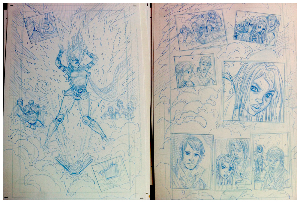
I start with throwing on the metal and work into one of these layout pages. I do them 2 up on an 8.5 by 11 plain old computer paper page. I try and pick out a panel in the script that has the most punch or importance in the page.

That panel I’ll change up; Break out the borders, make abnormally large, add a hundred ninja stars what ever? All kindling aside this is the most important part of the process. You need to concentrate on flow of the scene and it’s mood? Is this a dream sequence, flashback, fight or talking head sequence?
Know your techniques and keep them in your arsenal. You can’t montage a whole comic unless it’s right for the mood of the scene. Hard to read is always bad.
Keep your storytelling clear, ALWAYS clear.
That way when the main character gets drugged by a Space Samurai that montage will make a killer weapon of choice. In this scene The boys asked for an exploding book of power to show off to the people of Shrewsbury. So after a book of fairly straight up layouts I hadn’t pulled out the montage yet. I consider a good montage double page splash like killer guitar solo from Tony Iommi. My layouts are always super tiny and rough like a mountain range, but they are the road map to Amazing.
Once I’ve pulled this out of the script I take them and blow them up to 11 by 17 in Photoshop. I make them 10% opacity in CYAN only and print them on my boards. With it set up on the paper in Cyan it won’t show up on the scanner.
From here I hit the next stage, Penciling.
Now my pencils are not very tight because I ink my own work, but this is basically the tightening up phase. This is also where you get to become an actor. Going over the script again you want to pick the best emotion for the shot.
However, this is not time to swipe a Google jpeg image and trace it!!!
NOTE to artists! ARE you a comic artist or a dirty, sneaky tracer????
Poser? please, learn to draw, you’ll thank me for it!
You’ll find your style in no time. In my crew Horse tracers get ripped on! You can always spot a photo tracer because their work is stiff, looks like a snap shot from a film and when they have to draw something they can’t Google sketch-up guess what??? They can’t.
This absolutely kills the energy of the page and doesn’t make use of comics full potential. Look at your KIRBY people.
James Harren is killing it lately, as is the master Eric Canete! These guys drawings look like they are about to smack the taste out of my mouth.
Most artists working in comics do this tracing crap and I find all their work kinda looks the same.
Toth would be spinning in his grave!
So guess what? I’ve done it too. When I started out I thought it made my work look more pro, but I think I can easily say that it was my buddy Cameron Stewart who bullied me out of it. I secretly thank him everyday for doing it because that is when I truly found my style of storytelling and why my horses still look like dogs!
Be an artist not a tracer and live guilt free!
Now for inking!
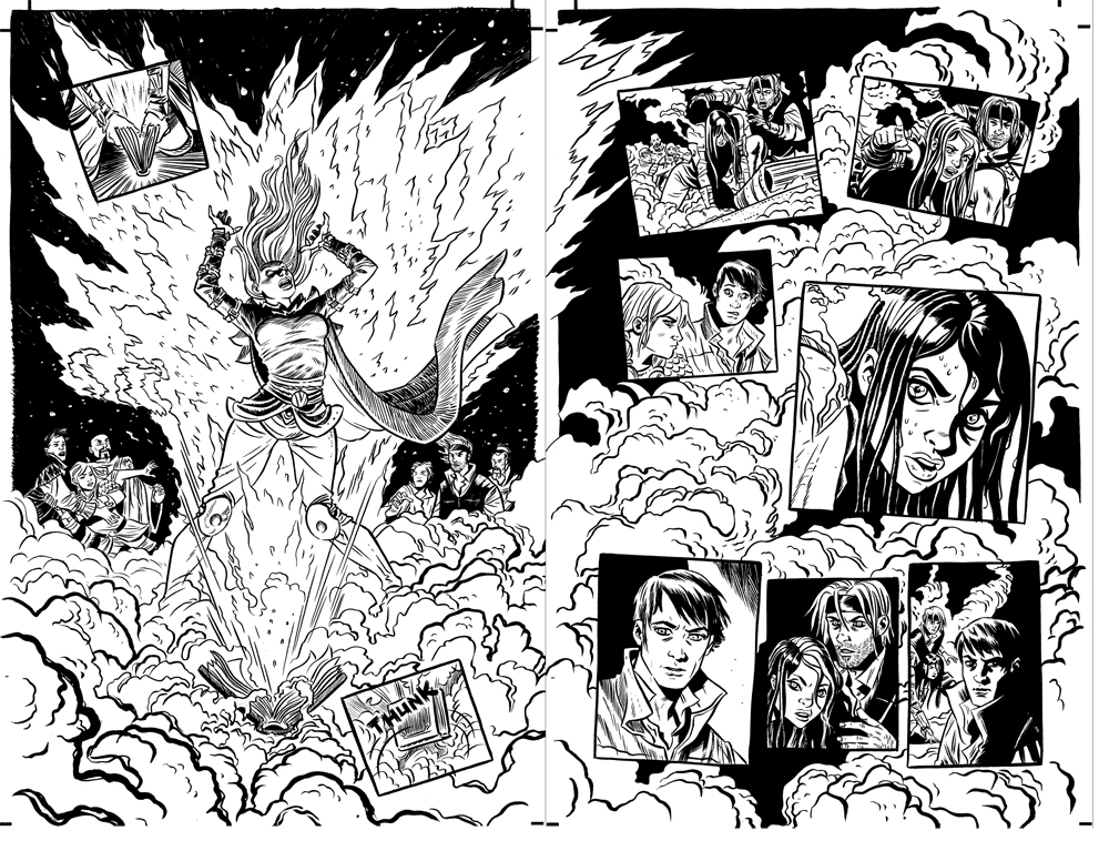
My favourite part! This is where you need to really concentrate on light. I have two major rules when working and writing comics. NO HALOS AND NO EXPOSITION.
No exposition I’ll save for the writing classes but no halos is important.
Before you lay down your inks it is important to design your Black Spotting. Halos are those silly white lines around a character because the black part of the head that is in shadow is touching a black background. Have some balls and ditch those stupid halos. They suck. If something is going to be drowned out put in a widow behind or a design element to the back to make that head pop. Inking is wicked tough! I still suck at it but work really hard to make it work.
This is my favourite part of the process and when I listen to really loud Black Sabbath!
Check out Toth or David Mazzucchelli, these guys are masters of the ink. My buddy Mike Cho is also freaking deadly as is my lovely fiancee Becky Cloonan. Mike is as amazingly technical as Becky is amazingly expressive. I learn a lot from Becky, she’s on her way to being one of the greatest comic creators of all time! In my book she is already but you’ll all see soon enough!
As for tools Becky and my weapon of choice is the Windsor Newton number 2. It does it all! It is my katana! Then comes the incredibly talented Shari Chankhamma!
Now straight up I hate colouring because I’m sooooo slow at it. I know what I want and have coloured my self often.
Heck I did the Green cover for this issue. However that was a cheat.
I did a giant painting on brown paper and worked back in with whites and greys so when I hit the computer all I had to do was throw flat colours in the back.
Now for my interiors I wanted a few things.
Number one I wanted the colour to have a bit more of a feminine feel. I know half our readers are female at least if not more and we had been colouring it for uh… how else do I say it but for “DUDES”??? Right now the readership for basically reading in general is 80% female.
Guys are spending less time reading and more time playing Black Ops, I know I do. Actually Dark Souls, but back to the issue.
I wanted the book to have a more 50/50 feel and Becky recommended Shari. It seemed perfect!
I also have one other rule! NO MUD! Comics are plagued today with muddy colour. Just because it looks “Sick” on the computer screen doesn’t mean the printer can match it! I have been murdered by this so… IMPORTANT to all colourists, learn atmospheric colouring!
Create depth more than anything. Keep the dark AND vibrant colours in the foreground and the light in the back. Shari is a freaking NINJA with this! She also in a line hold master. I.E. she colours over the black lines when needed giving the work a somewhat 3D feel!

Wait till issue two! Her colouring freaked me out it was so good!
Anyway, there you have it.
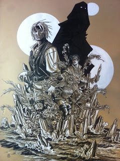
I’m not going to go to much into all those satanic symbols and genitals I hide in tree trunks or foliage, I’ll save that for when I talk about Black Church. But this should give a peak into how I create! Keep drawing true believers and be bold! If some other peeps are willing to trace themselves off a cliff doesn’t mean you should!
You Pal,
Andy Belanger